
TLDR: We created custom photographer branding and a website for Ben Minegar Photography rooted in his personal story and the idea of meaningful progress. From an imperfect red dot to symbols inspired by the Continental Divide Trail, each detail reflects the experiences and values behind Ben and his work.
Ben Minegar’s path to photography didn’t begin behind the camera. After starting his career as a lawyer in Pennsylvania, he discovered a passion for photography that began as a hobby in 2012. Over time, that passion became something more, eventually leading him to leave the legal profession and pursue commercial photography full-time. Through hands-on experience and an evolving portfolio, Ben built a successful business helping companies bring their ideas and stories to life through impactful imagery.
Today, Ben specializes in commercial photography for businesses, brands, and advertising agencies, collaborating on creative campaigns both locally and nationally. As his career continued to move forward, it was time for his photographer branding to do the same. We created custom branding and a website that reflect his approach to photography, celebrate the progress that has shaped his story, and give his business a strong foundation for whatever comes next.
Designing a Brand Around Ben’s Story
When creating Ben’s visual identity, we wanted every element to connect back to the person behind the photography. His work, values, and personal experiences became part of the creative direction, shaping a brand centered on movement, meaningful progress, and authenticity rather than perfection.
A Logo Rooted in Ben’s Story
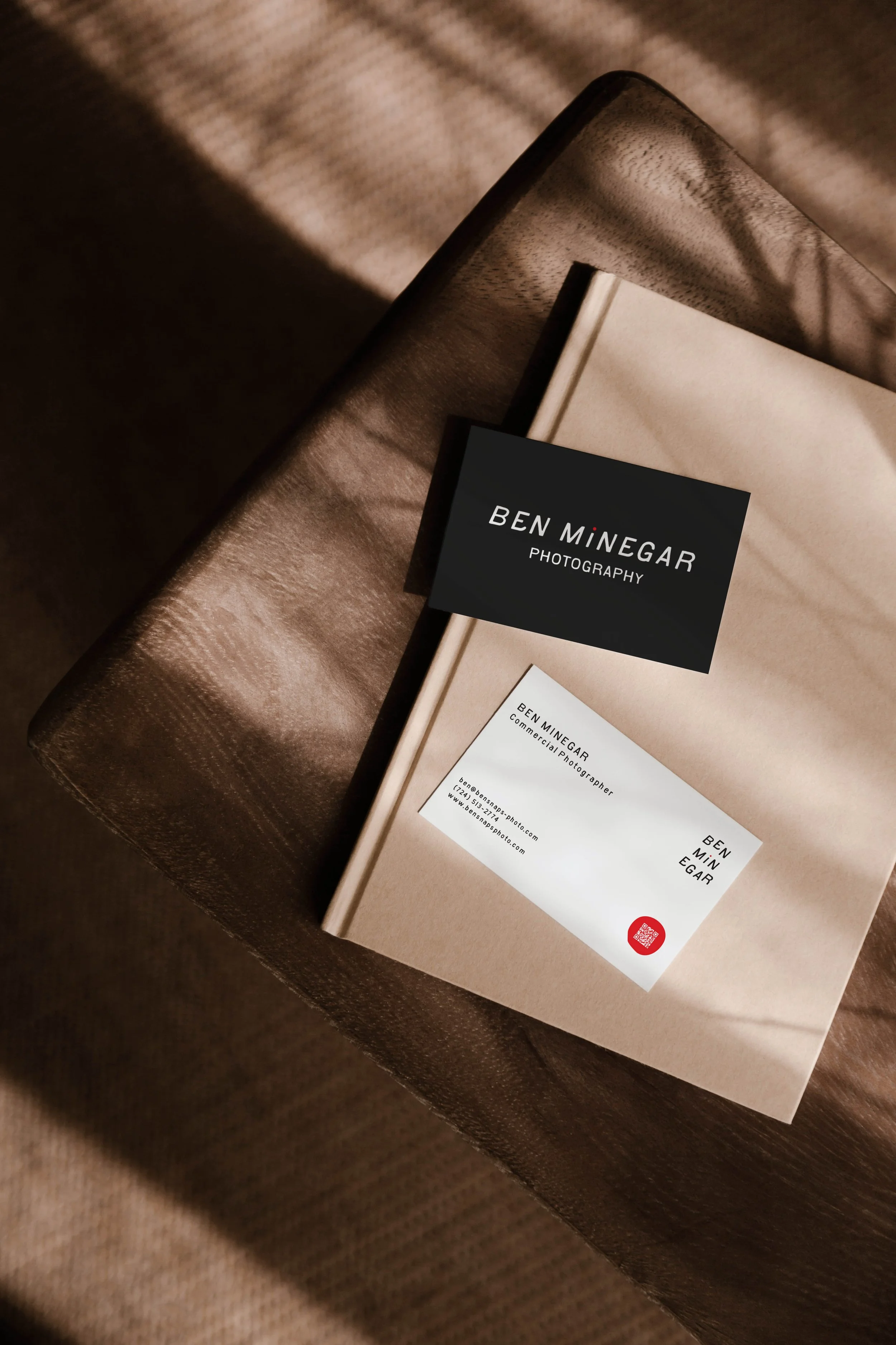
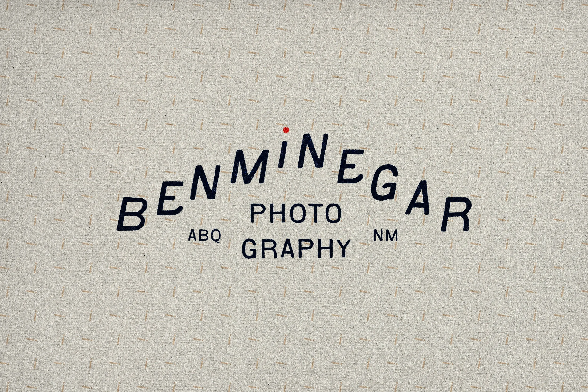
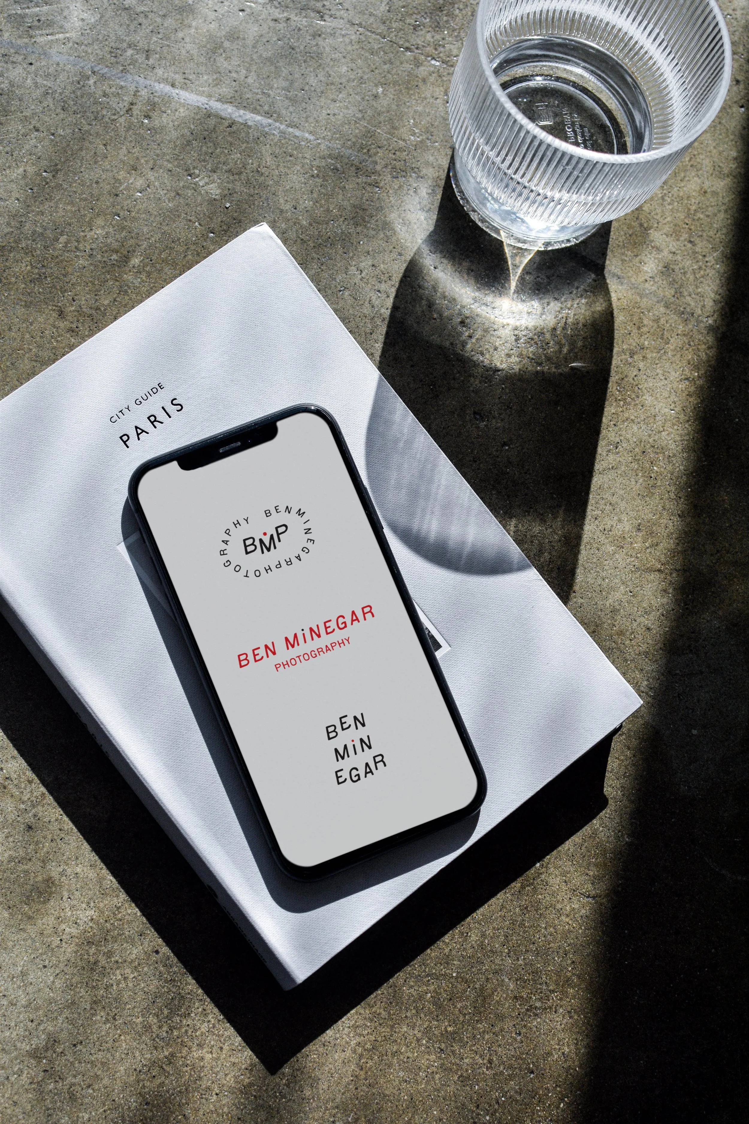
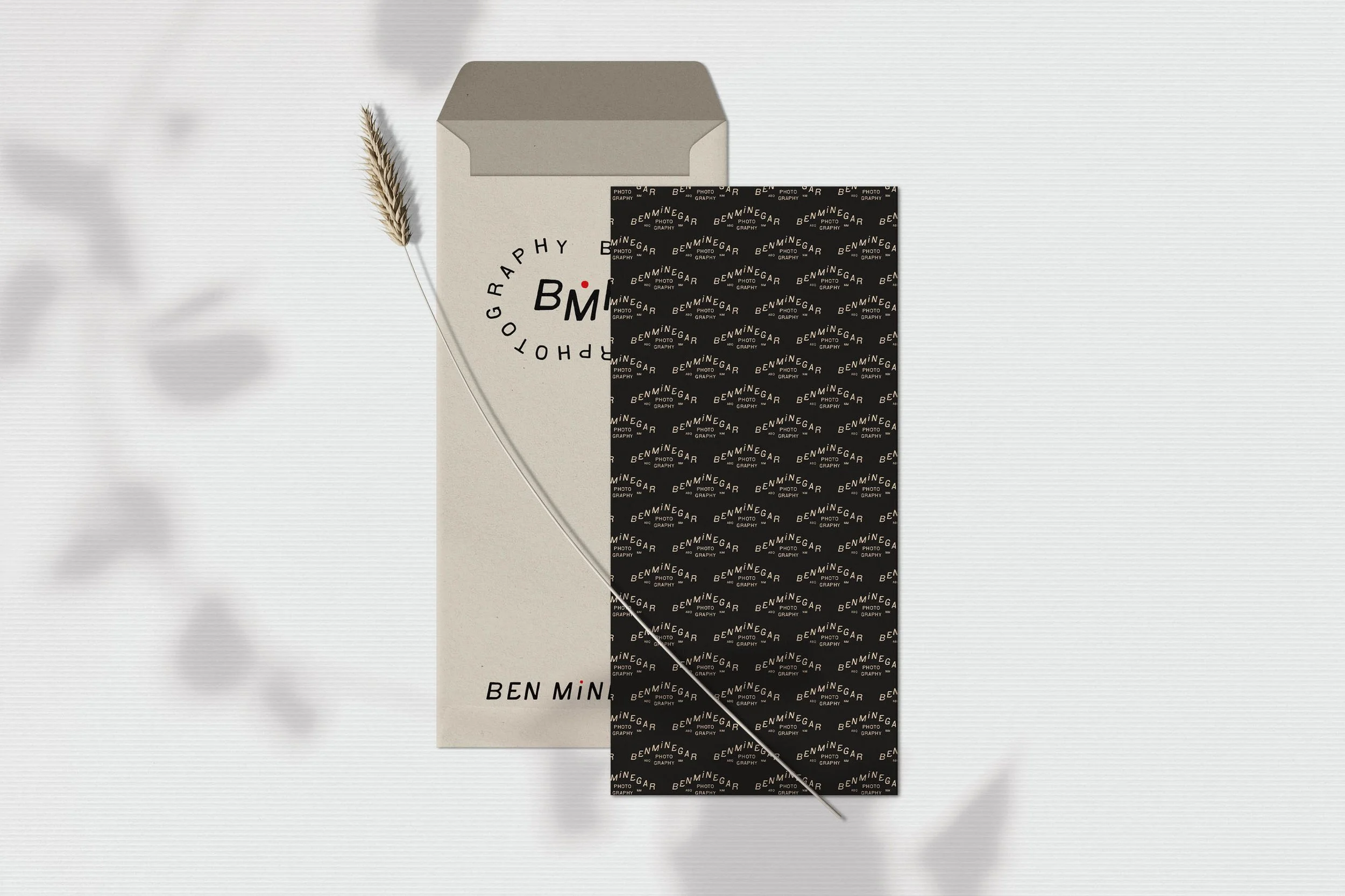
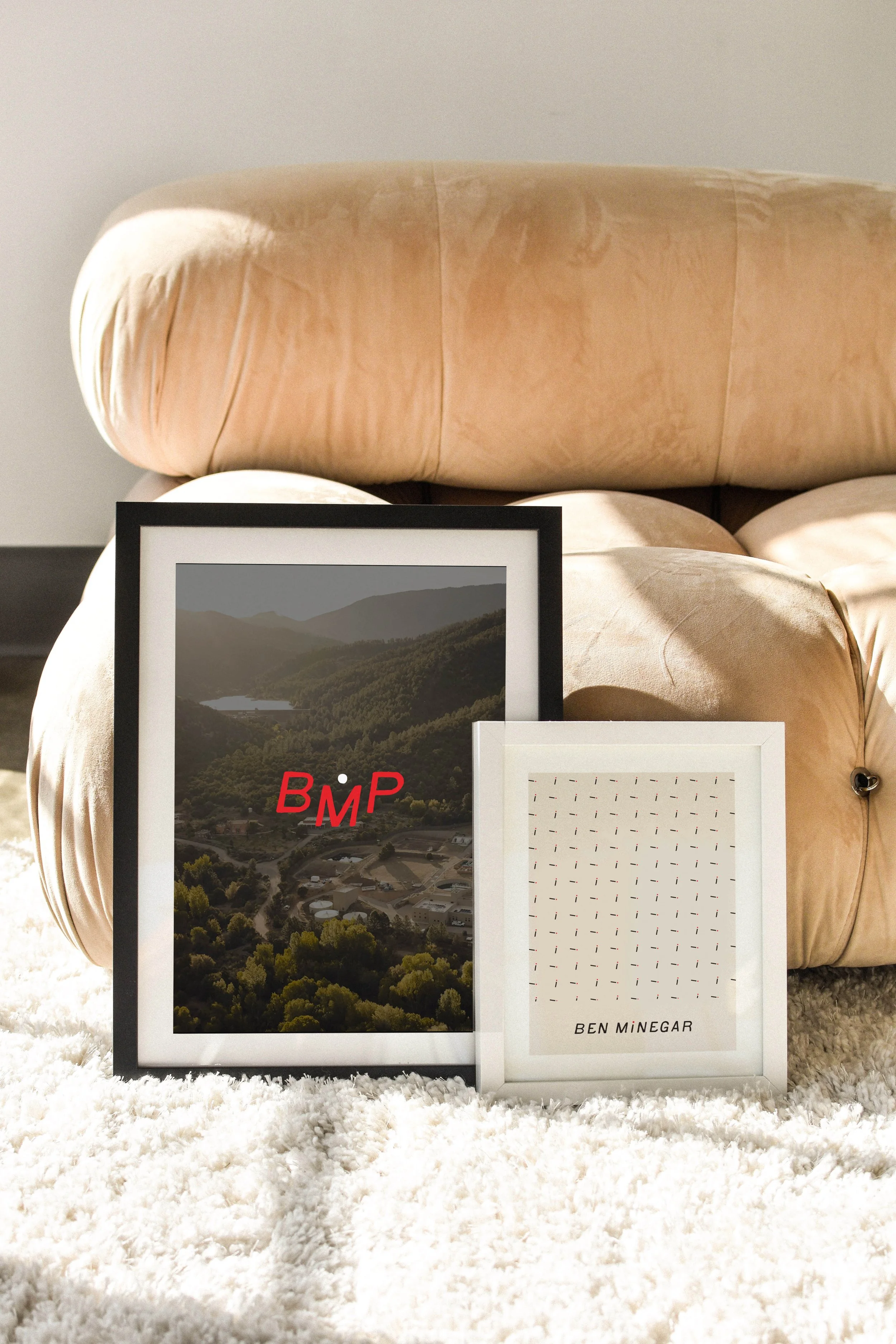
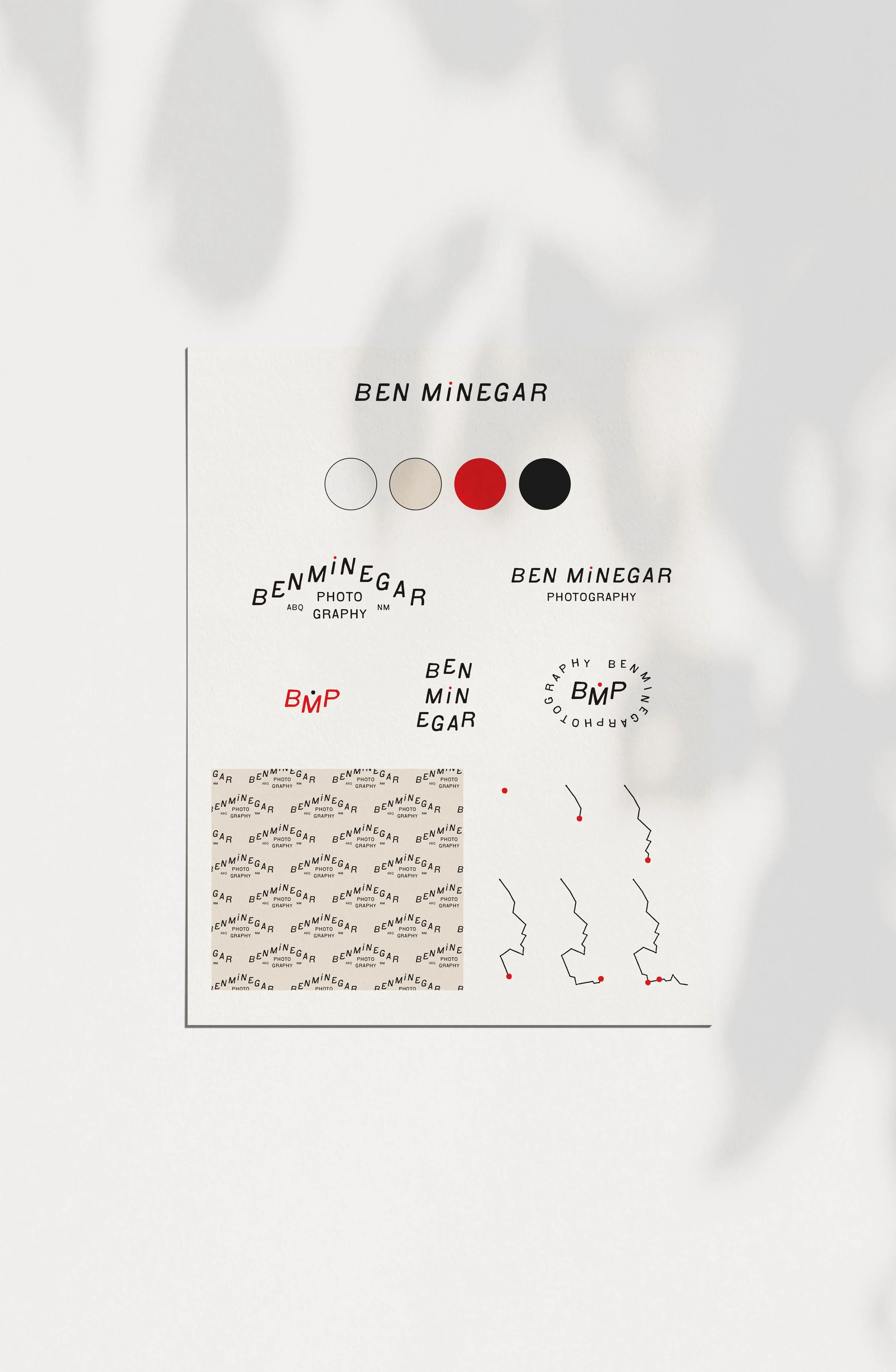
Ben’s logo system brings together several pieces of his story. At the center is a small red dot that leads each logo and mark, representing a starting point, the next step forward, and the meaningful moments that become landmarks along the way. Its intentionally imperfect shape reflects the idea that life rarely follows a perfect path, connecting back to Ben’s appreciation for authenticity over perfection.
Several logo variations take the story even further. One forms the silhouette of a mountain as a nod to Ben’s time hiking the Continental Divide Trail, bringing ideas of challenge, resilience, perspective, and continuing forward one step at a time into the identity.

Illustrating Progress and Connection
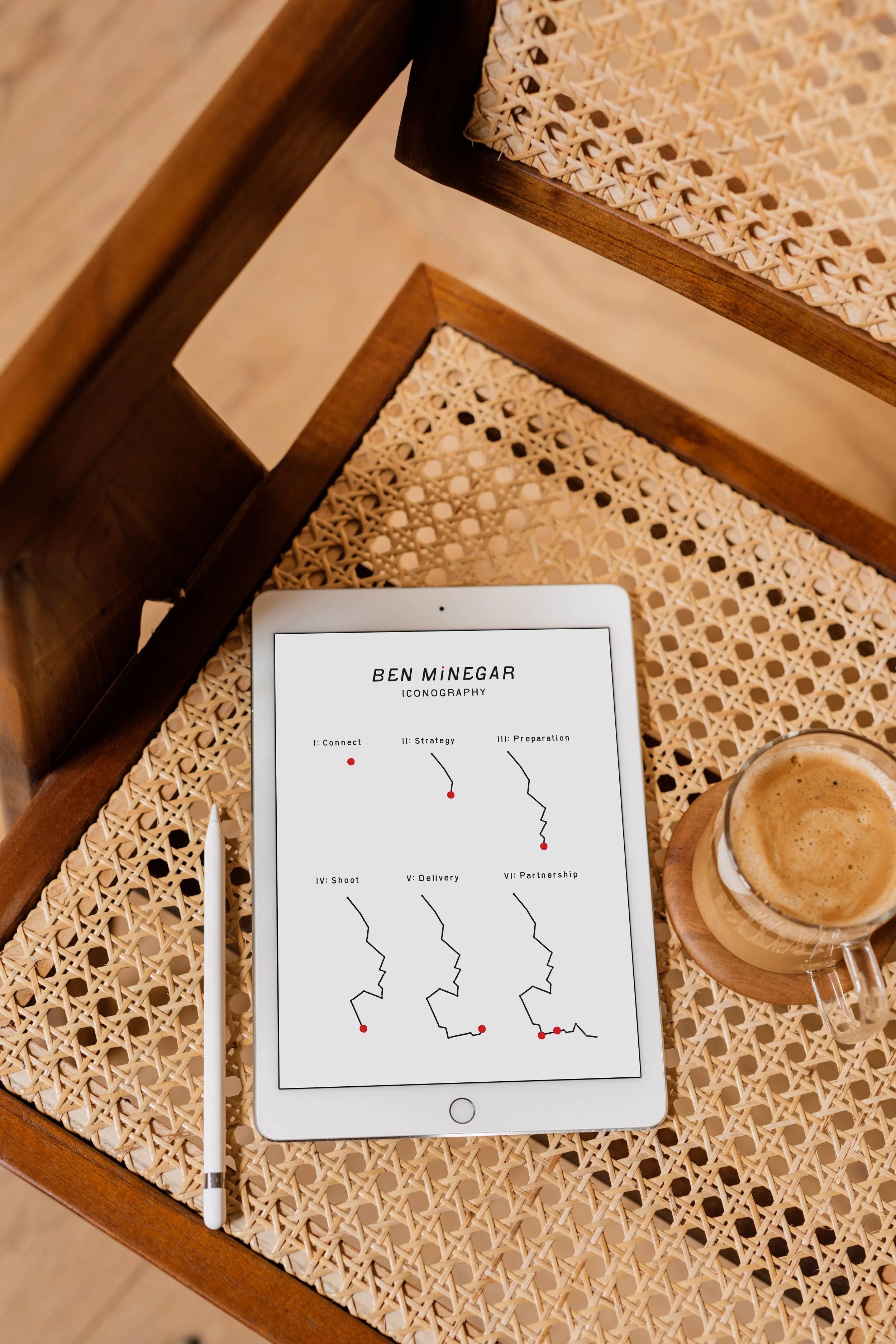
The custom icon system draws from the shape of the Continental Divide Trail, with each variation gradually becoming more complete. Together, they represent the progression of working with Ben, from the first point of connection and building trust to creative collaboration and a lasting partnership. Each mark gives another piece of Ben’s story a place within the visual identity while creating a system that can grow and change across different brand applications.
A Timeless Color Palette With a Bold Accent
Warm neutrals and deep charcoal create a timeless, understated foundation that keeps Ben’s photography in focus while bringing honesty, confidence, and craftsmanship to the brand. Against these quieter tones, the signature red creates an intentional point of focus. It represents passion, direction, and the moments worth remembering, while connecting each brand touchpoint back to the red dot at the center of the identity.
Bringing the Photographer Branding Online
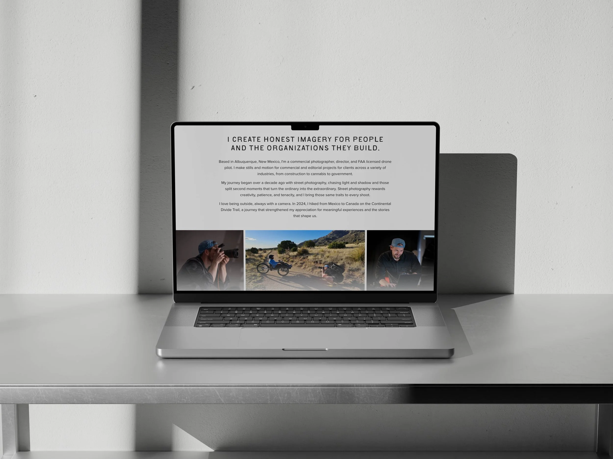
Just like Ben’s branding, we designed his website to feel dynamic while maintaining a clean, intentional layout that keeps his photography at the forefront. The goal was to add movement, personality, and functionality without letting any of it compete with the work visitors came to see.
Here’s how we brought the brand into his custom photography website:
Consistent branding throughout: Ben’s colors, typography, and visual elements carry seamlessly into the website, creating a cohesive experience across every page.
A custom red dot cursor: The signature red dot becomes an interactive cursor, bringing a recognizable piece of Ben’s branding into the way visitors actually experience the site.
Intentional movement: Text overlays and subtle transitions introduce projects and add energy to the website without distracting from the photography.
Dedicated service pages: Individual pages make it easy for potential clients to explore Ben’s photography services and find the information most relevant to their needs.
Clear ways to connect: Strategic calls to action and complete contact details make the next step simple for potential clients who are ready to work with Ben.
Altogether, the website gives Ben’s work a place to take center stage while creating an experience that feels cohesive with his brand and helps potential clients build trust before reaching out. From the red dot following visitors across the screen to the movement introducing each project, the details that began within the visual identity continue throughout the website rather than stopping at the logo. See how it all comes together on the finished Ben Minegar Photography website.





Every Business Has a Story to Tell
There’s a lot of conversation about authenticity these days, especially when businesses have more tools than ever to create content and visuals quickly. But what makes a brand genuinely difficult to replicate usually isn’t following the latest trend. It’s finding the details that already belong to the person or business behind it and giving them a purpose.
For Ben, those details came from an unexpected career change, miles spent on the Continental Divide Trail, an imperfect red dot, and a belief in progress rather than perfection. On their own, they might seem like small pieces of a much bigger story. Together, they gave us something much more interesting to build a brand around.
Your story will naturally look different, and that’s the point. If you’re ready to find the details that can make your own brand feel unmistakably yours and pair them with the right strategy, let’s talk.
Key Takeaways
Ben’s photographer branding is rooted in his personal experiences, values, and approach to photography.
The red dot represents a starting point, forward movement, meaningful landmarks, and the imperfect nature of progress.
The Continental Divide Trail inspired both the mountain logo variation and an evolving icon system centered on progress and connection.
An understated palette keeps Ben’s photography at the forefront, while the signature red creates a recognizable point of focus.
The website extends those ideas through movement, interactive details, dedicated service pages, and clear ways for potential clients to connect.